Thermometer app is helping map the spread of illnesses
Tonight Rachel Maddow once again hosted a highly compelling show. One fascinating segment detailed the work of Kinsa Health which sells an app-connected thermometer. By anonymously aggregating data from the app, it can produce “heat maps” which may alert communities to possible outbreaks of illness in their area. The app is measuring only one specific thing: the temperature of the user, but even that one bit of data, when collected from a large number of users across the nation, can be very illuminating.
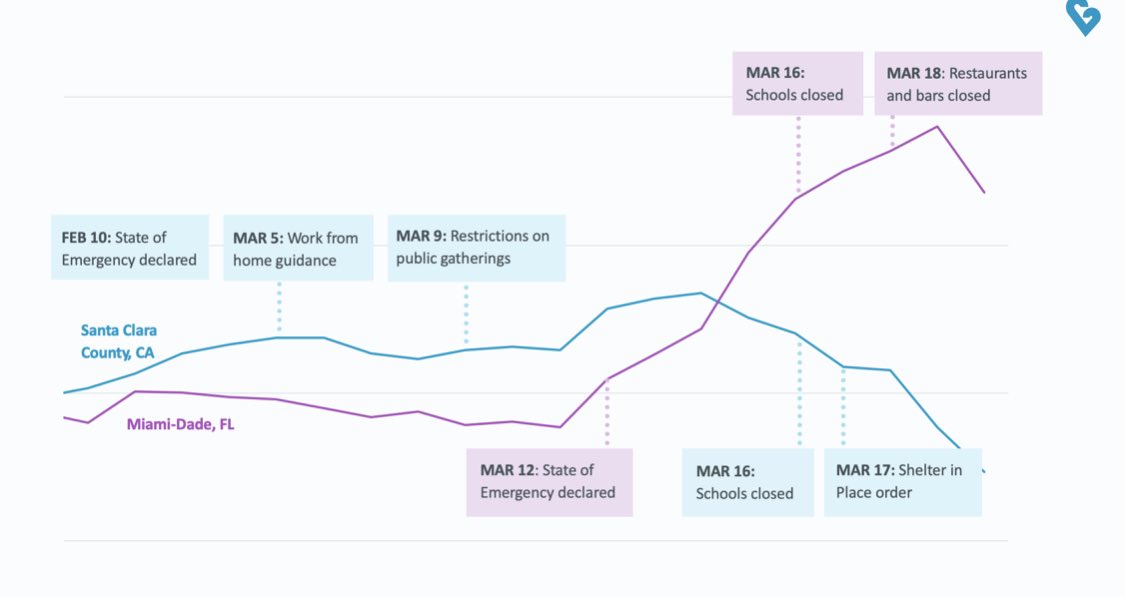
One thing it’s doing is helping to confirm that social distancing really does work to reduce the spread of illnesses. You’d might think “well that’s common sense,” but science demands supporting data before a theory can be elevated to a fact – and this app is helping with that.
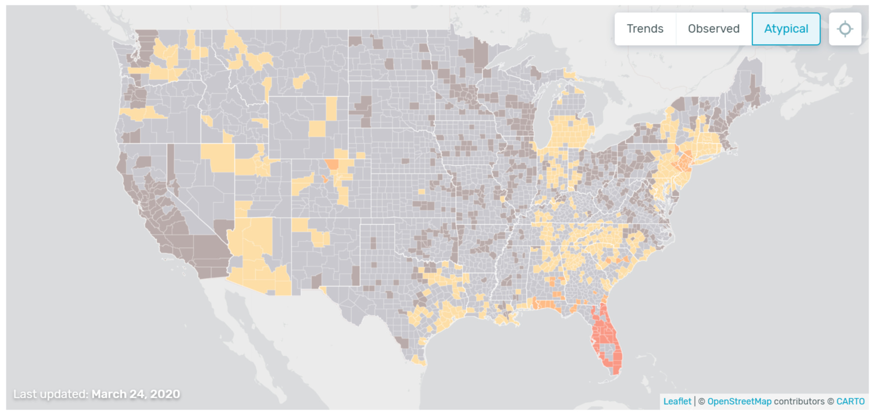
It’s also pointing to anomalies that can serve as “red flags” to health providers and local officials responsible for making decisions about health policies. Right now, one of the anomalies appears to be covering much of the state of Florida – it’s showing more people with elevated temperatures than would normally be expected – taking into account the seasonal impact of the flu. Could this be an early warning sign that coronavirus is spreading in Florida? – or could it be some other factor, or even a problem with the data reporting? One of the shortcomings of Kinsa’s heat maps is that they currently don’t have as a large a data sample as they would like – so they caution about jumping to conclusions. But certainly you would think that officials in Florida would want to take a deep dive into what may be happening in their state.
When Maddow’s segment becomes available, I’ll post it. In the meantime, here’s a good article about what Kinsa is up to – it highlights the promising possibilities of their work, along with its current limitations. It has some good information, but reads a little like a press release so I’d take it with a grain of salt.
Kinsa Insights has long worked to improve real-time illness tracking with its flagship smart thermometer. Kinsa’s smart thermometers report users’ temperatures back to the company’s databases, and that data is then compiled into graphs and maps of fevers across the United States. In the past, this data has been used to accurately predict the spread of influenza across the country.
Now Kinsa has set its sight on the COVID-19 pandemic. By comparing current spikes in fever reporting to those typical of an area at a given time, Kinsa has created a map of “atypical” illness levels across the country. The resulting Health Weather Map presents a picture of abnormal numbers of fevers, which may be linked to localized outbreaks of COVID-19.
Kinsa notes — prominently, at the top of the map’s page — that this data does not represent COVID-19 activity. Rather, Kinsa hopes this data can be viewed alongside other indicators to show where and how COVID-19 is spreading.
Kinsa is right: live-tracking the spread of a novel virus like COVID-19 could prove invaluable in ending the pandemic. **But if the prospect of doing so sounds like a futuristic dream, that’s because it is. Between a shortage of the company’s smart thermometers and scattered, incomplete data, Kinsa’s Health Weather map is more a prototype for the future than a solution for the present.
Kinsa Health chart with data that supports the effectiveness of social distancing measures in two counties (from this tweet by Kinsa).
_

Today’s national “Health Weather Map” from Kinsa showing possible atypical temperature readings in Florida.
Note: If you go to Kinsa’s map page, you can display this version of the map by clicking on the “Atypical” button in the upper right corner.
Kinsa is very clear that its data collection and reporting has limitations. In other words, we should not jump to conclusions, but only use their data as a way of pointing to areas that may warrant additional research.


 Gov. D. Patrick is, & anyone else spouting this garbage. Not to mention that COVID-19 doesn’t respect arbitrary age cut-offs.

 @HillaryClinton


